

Government’s Share of Economy, 1950 to 2075
Peter Boockvar dug up these fascinating charts from this CBO report from 2002.
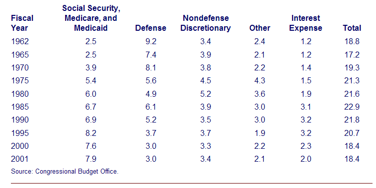
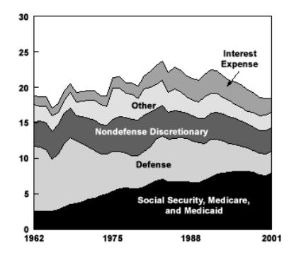
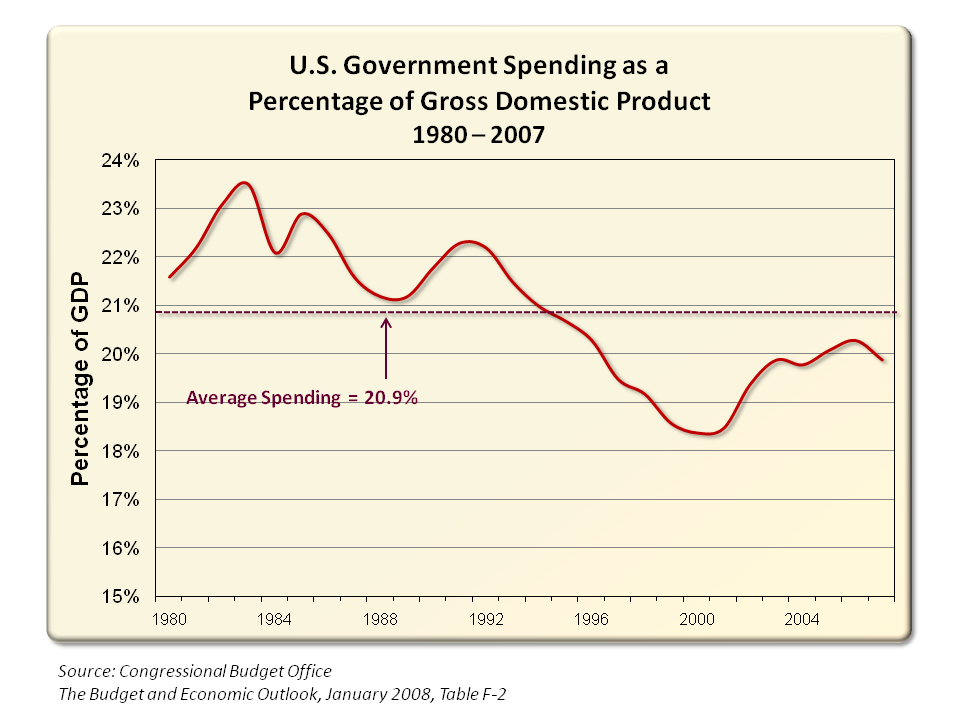
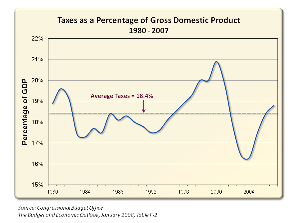
What really surprised me is how consistent the US economy has been for most the latter half of the 20th century: About 20% of GDP. It starts about 19%, peaks at about 23% then falls back to about 18 and a half%.
Note that this data is before the Bush’s Prescription Drug Act or Obama’s Health Care bill.
Table
Chart
Charts via CBO, Perot Charts
More charts after the jump . . .
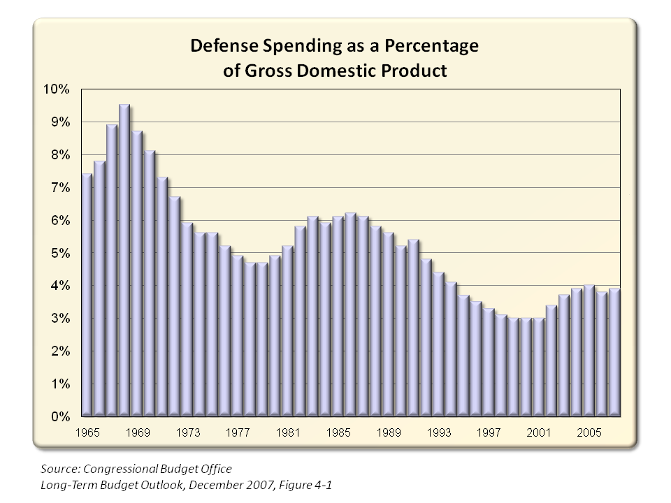
From Perot Charts:
>
Source:
A 125-Year Picture of the Federal Government’s Share of the Economy, 1950 to 2075
CBO, No. 1, June 14, 2002; Revised July 3, 2002
http://www.cbo.gov/doc.cfm?index=3521&type=0
What really surprised me is how consistent the US economy has been for most the latter half of the 20th century: About 20% of GDP. It starts about 19%, peaks at about 23% then falls back to about 18 and a half%.
Note that this data is before the Bush’s Prescription Drug Act or Obama’s Health Care bill.
Federal Outlays, 1962 to 2001
(As a percentage of GDP)Table
Chart
Charts via CBO, Perot Charts
More charts after the jump . . .
From Perot Charts:
>
Source:
A 125-Year Picture of the Federal Government’s Share of the Economy, 1950 to 2075
CBO, No. 1, June 14, 2002; Revised July 3, 2002
http://www.cbo.gov/doc.cfm?index=3521&type=0


 Posts
Posts


No comments:
Post a Comment