"Predictions and explanations are symmetrical and reversible."

- Karl Popper via George Soros

Wednesday, February 8, 2012

Upside forecast

Contrarian Analysis for 2012. Part 1.

Posted on 30 January 2012 by admin

Could 2012 Surprise to the Upside?

by Guest Author John Slater, Capital Matters

In January we are trained to predict the likely course of the coming year and more often than not we get it wrong. This year virtually everyone has had the same prediction: “We’ll muddle along at around 2.5% growth unless something really bad happens and then all bets are off.” The outliers tend to focus on the possibility that we are heading for a recession based in part on the negative call from the Economic Cycle Research Institute (ECRI). Yet some of the economic data is not cooperating with the doomsayers and our observations in the real world are that business for many of our clients is not all that bad and is in fact improving.

What if the pessimists are wrong and 2012 turns out to be a far more positive year for the economy than many are predicting? While the jury is still out, the data continues to improve in terms of employment and consumer spending.
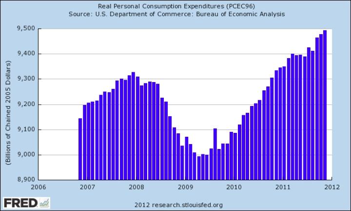
Credit to Hale Stewart who recently published this and a number of other charts supportive of a positive economic case on Seeking Alpha. What’s the chance he could turn out to be right? Ignoring for the moment all the could go wrongs, what’s the case for a far stronger 2012 than is currently being predicted?

1. Everyone wants things to get better. This is not trivial. After four years of depression, everyone longs for the good old days. 2012 is predicted to be the best year since 2007 for the travel industry. What happens if Americans who have been accumulating dry powder for the past four years suddenly loosen their purse strings?

2. The Fed is committed to a massive and continuing program of monetizing the massive deficits the federal government continues to run. As we wrote recently, this has created a huge overhang of reserves in the banking industry. Should the banks begin to use these reserves to support new credit creation the impact would be significant.

3. The banks may be doing exactly that. For the first time since the crash we can see positive movement in new bank credit creation.
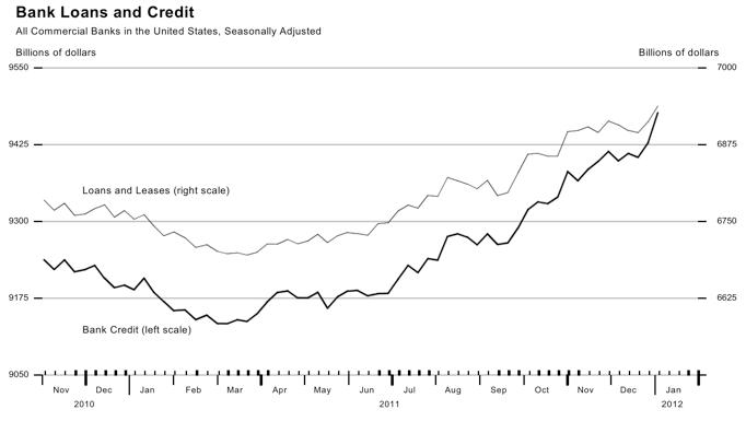
Source: St. Louis Federal Reserve

In our investment banking practice we stay close to lender who can fund our client’s growth and provide the financing to make our M&A deals happen. For the first time in years, we are seeing evidence that some banks are getting serious about making commercial loans. Bank earnings were reported this week with varying results. While many banks are still suffering from the effects of the crash, a few, such as Wells Fargo, appear to be making real progress. It’s not hard to imagine that somewhere in America a bank CEO pulled his troops together this week to ask what could be done to put their institution on the positive side of that comparison. In response someone on his team may have actually suggested that banks used to make money by making loans. Multiplied across the economy, the impact could be significant.

4. This is an election year. With the exception of 2008, recent election years have generally been very good for the economy.
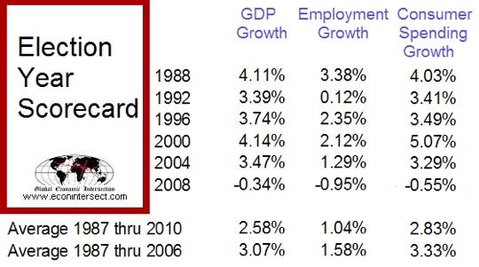
Source: www.econointersect.com; Seeking Alpha

5. Outside of the western economies, the world continues to boom. Many believe that China is at risk of a hard landing, but the likelihood that 2012 is the year for such a negative outcome is quite low. China is in the midst of a historic transfer of leadership. The Chinese government will do everything possible to assure that this transfer does not happen during a period of economic crisis. They have many tools, including trillions of dollars of currency reserves, they can use to keep the music playing and have shown a past willingness to do so. Ongoing growth is certainly not limited to China; even Africa shows promise of real economic progress. The U. S. economy will continue to benefit from this ongoing explosion of global growth.

6. Finally and closer to home we are seeing signs of a pickup in merger and acquisition activity. Our industry has been in a deep depression since 2007. While there has been plenty of money on the sidelines in private equity and strategic coffers, weak private company earnings and the dearth of bank leverage have kept the lid on the deals market. Recently our new activity pipeline has shown signs of increasing strongly and we’ve heard reports from a number of law firms that their securities and transaction teams were quite business in Q4 2011 with strong activity sustained into 2012.

The deals business is an important barometer of economic activity. Deals generate fee incomes to banks, law firms, accounting firms and investment bankers with a significant multiplier effect in local economies. Equally important private company exits free up a significant amount of investment capital and former owners who have liquefied their business have a relatively strong predilection to support new ventures as angel investors and to invest a meaningful portion of their new liquidity in equities.

2012 will provide us with plenty of surprises. We’re just contrarian enough to suggest that one of those surprises may be a much stronger economy than the consensus expects.

About the Author

John Slater, a FOCUS Partner and Capital Financing Team Leader, has twenty eight years of M&A and capital raising experience. Prior to that time, he spent nine years as a practicing attorney, focused primarily on financial transactions, securities and tax matters. Mr. Slater has served clients in industries ranging from information technology and software based services, telecom, broadband distribution, digital media, and business services to manufacturing, health care and distribution logistics.  Complete bio is available here.

The New Conference Board LEI: First Look

The New Conference Board LEI: First Look

Posted on 30 January 2012 by admin

by Guest Author Dwaine van Vuuren, PowerStocks Investment Research, cross posted from Advisor Perspectives, dshort.com

The much anticipated Conference Board LEI revision is out. Many people were fearing that the removal of M2 from the composite would plunge it into recession territory, but that is not the case. Our own investigations into this matter in the lead up to the announcement revealed as such, but it is comforting to receive hard confirmation now.

Composite LEI’s such as the e-forecasting.com eLEI, the Conference Board US-LEI, the OECD US-LEI and the ECRI Weekly Leading Index (WLI) are generally composed of a small set (no more than 10) of well selected leading economic indicators that as a composite are subjected to rigorous statistical and out-of-sample testing. You can see a perfect example of the rigors of such statistical selection in the white paper produced by the Conference Board on the construction of their new LEI. For that reason we lean toward the use of these composites for recession forecasting purposes rather than large sets of seemingly unrelated economic leading indicators cobbled together. There is the well-known saying that if you torture large arbitrary data series enough, they will tell you any story you wish them to.

We do not wish to debate the revisions or which LEI is the best (more on that in future articles). Instead, we will have a “first look” at the suitability of the new LEI for recession dating. For differences between the new and old LEI, see Doug Short’s commentary here. Using a 6-months smoothed compound annualized growth rate of the monthly LEI (as defined by Geoffrey H. Moore) into Probit recession probability models, the new Conference Board LEI gives very accurate leading probabilities of recession with zero false positives since 1967 as shown below:

Click on graph for larger image.

The old LEI was more optimistic than the new one, but as you can see, the new LEI is still well below the trigger level for a recession call with probability of being in a recession now sitting at 0.7% and of being in recession within the next 6 months sitting at 6.2%. The one thing we notice is that once the probability of recession now rises above 13% this has ALWAYS led to recession within 2, 3, 10, 7, 0, 5 and 4 months respectively since 1967 with zero false alarms. This gives an average lead of 4.43 months, or 3.43 months to the real-time observer (since the LEI is one month post-dated).

If we prefer to observe the actual 6-month smoothed growth rates (annualised) themselves instead of the probabilities of recession derived therefrom, the chart below shows the average approach path of the LEI growth rate into NBER recession:

Click on graph for larger image.

We note that the growth rate needs to fall below zero to give us an average 6-months (5 month to real-time observer) warning of recession. The growth rate over the last 12 months is now highly correlated with an average recession approach path meaning we need to keep on our toes despite it being above zero. However, a small consolation is that the last 12 months is tracking quite a bit above the average peak approach path.

In similar fashion to that which we described above, neither the e-forecasting.com eLEI, the Conference Board LEI, nor the OECD US-LEI is forecasting recession in the next 3-4 months. The only other composite LEI flagging recession is the ECRI Weekly Leading Index (WLI), but as we stated in our previous posting (Further Improving on the use of the WLI) this is a weekly leading index and in the original spirit of the construction of said index, it is more timely and frequent but also subject to far less accuracy (more false positives).

This by no means says that recession within the next 6-12 months is out of the question. But it says we are neither in recession now nor should we be in one for the next 3 months at least. There is no doubt the US economy faces significant external risk. Coupled with a sub-par recovery, this means the smallest external shock can plunge us into recession. These external risks are not fully discounted into all the components of these composite LEI’s namely a possible steep and protracted Euro-area recession, an EU member sovereign default or credit event, hard landing in China, failure by congress to reach agreement on deficit reductions, further possible US credit rating downgrades, Iran tensions/conflicts and oil-price shocks. The probability models just look at what we are seeing in the US economic leading indicators and do not take into account these external factors (since in our view, this would be speculation and we just want to deal with hard real numbers). Should these external shocks come to light, they will certainly show up in the US economy somewhere (in “short-order”) and then be detected by models, but until then one cannot speculate on the probability of these external risks. We can only acknowledge they exist, and are many. Our favoured approach is to watch short leading probabilities (4-6 months) and action stock market positions accordingly as having to action long-leading predictions that can vary anywhere between 6 to 18 months with wide standard deviation is unlikely to produce productive results in the long run.

Related Articles

Conference Board: LEI to be Revised by Lance Roberts (GEI News, 19 Jan 2012)

All Posts on Leading Economic Indicator

All Posts on Economic Forecasts


About the Author

Dwaine van Vuuren is CEO of PowerStocks Investment Research, a South African-based provider of investment research. If you would like to receive the next 4 weeks SuperIndex Recession Reports for free, just email us at research@powerstocks.co.za with FREE SUPERINDEX in the subject line.

Recovery Measures still below peak: Calculated Risk

Recovery Measures still below peak

by CalculatedRisk

By request, here is an update to four key indicators used by the NBER for business cycle dating: GDP, Employment, Industrial production and real personal income less transfer payments.
Note: The following graphs are all constructed as a percent of the peak in each indicator. This shows when the indicator has bottomed - and when the indicator has returned to the level of the previous peak. If the indicator is at a new peak, the value is 100%.
These graphs show that several major indicators are still significantly below the pre-recession peaks.
GDP Percent Previous PeakClick on graph for larger image.
This graph is for real GDP through Q4 2011. Real GDP returned to the pre-recession in Q3 2011, and Gross Domestic Income (not shown) returned to the pre-recession peak in Q2 - GDI for Q4 will be released with the 2nd estimate of GDP. (For a discussion of GDI, see here).
At the worst point, real GDP was off 5.1% from the 2007 peak. Real GDI was off 5.7% at the trough.
Personal Income less TransferReal GDP has performed better than other indicators ...
This graph shows real personal income less transfer payments as a percent of the previous peak through December.
This measure was off 10.7% at the trough.
Real personal income less transfer payments is still 4.8% below the previous peak.
Industrial Production This graph is for industrial production through December.
Industrial production was off over 17% at the trough, and has been one of the stronger performing sectors during the recovery.
However industrial production is still 5.4% below the pre-recession peak, and it will probably be some time before industrial production returns to pre-recession levels.
Employment The final graph is for employment. This is similar to the graph I post every month comparing percent payroll jobs lost in several recessions.
Payroll employment is still 4.1% below the pre-recession peak.
If the economy adds 243 thousand payroll jobs per month on average (the January report), it will take another 2 years to get back to the pre-recession employment peak. And that doesn't count growth of the working age population over the last 4+ years.
Yesterday:
Summary for Week ending February 3rd
Schedule for Week of February 5th

Calculated Risk says Housing Bottom is Here


Housing Bottom is Here

by CalculatedRisk

There have been some recent articles arguing the “housing bottom is nowhere in sight”. That isn’t my view.
First there are two bottoms for housing. The first is for new home sales, housing starts and residential investment. The second bottom is for prices. Sometimes these bottoms can happen years apart.
For the economy and jobs, the bottom for housing starts and new home sales is more important than the bottom for prices. However individual homeowners and potential home buyers are naturally more interested in prices. So when we discuss a “bottom” for housing, we need to be clear on what we mean.
Total Housing Starts and Single Family Housing Starts Click on graph for larger image.
For new home sales and housing starts, it appears the bottom is in, and I expect an increase in both starts and sales in 2012.
As the first graph shows, housing starts, both total and single family, bottomed in 2009 and have mostly moved sideways since then - with some distortions due to the ill-conceived housing tax credit.
New Home SalesNew Home sales probably bottomed in mid-2010 and have flat lined since then.
Back in 2009, when I first wrote about the two bottoms, I thought we were close on housing starts and new home sales - but that it was "way too early to try to call the bottom in prices." In real terms, house prices have fallen another 10% to 15% since I wrote that post according to the CoreLogic and Case-Shiller house price indexes.
And it now appears we can look for the bottom in prices. My guess is that nominal house prices, using the national repeat sales indexes and not seasonally adjusted, will bottom in March 2012.
The problem with using the house price indexes to look for a bottom is that they are reported with a significant lag. As an example, the recently released Case-Shiller index was for November and the index is an average of September, October and November - so it is a report for several months ago. The CoreLogic index is a little more current - the recent release was for December, and CoreLogic uses a weighted average for prices (December weighted the most) - but that is still quite a lag.
Both of those indexes will bottom seasonally around March, and then start increasing again.
There are several reasons I think that house prices are close to a bottom. First prices are close to normal looking at the price-to-rent ratio and real prices (especially if prices fall another 4% to 5% NSA between the November Case-Shiller report and the March report). Second the large decline in listed inventory means less downward pressure on house prices, and third, I think that several policy initiatives will lessen the pressure from distressed sales (the probable mortgage settlement, the HARP refinance program, and more).
Of course these are national price indexes and there will be significant variability across the country. Areas with a large backlog of distressed properties - especially some states with a judicial foreclosure process - will probably see further price declines.
And this doesn't mean prices will increase significantly any time soon. Usually towards the end of a housing bust, nominal prices mostly move sideways for a few years, and real prices (adjusted for inflation) could even decline for another 2 or 3 years.
But most homeowners and home buyers focus on nominal prices and there is reasonable chance that the bottom is here.

Goldman Sachs participation rate forecast

http://feedproxy.google.com/~r/CalculatedRisk/~3/eZy68kdxc58/impact-of-changes-in-participation-rate.html

by CalculatedRisk
Yesterday Goldman Goldman Sachs economist Sven Jari Stehn argued that the labor force participation rate would remain "broadly flat at 63.7% through the end of 2013". He argued there would be a cyclical boost to the participation rate this year from the recovering economy, but a structural decline in the participation rate due to demographics. (Note: some decline in the participation rate has been expected over the next couple of decades).

The updated population controls from the 2010 Census showed a higher percentage of younger and older workers compared to the prime working age group (25 to 54), and also more women (participation rate is lower for women) than originally estimated - so the aggregate participation rate is now at 63.7%. Stehn argues that structural factors alone could push the aggregate participation rate down further to 63.1% by the end of 2012, but that this will probably be offset by more people returning to the labor force as the economy recovers.

The participation rate plays a key role in calculating to unemployment rate. First a few definitions from the BLS Glossary:

• Civilian noninstitutional population: Included are persons 16 years of age and older residing in the 50 States and the District of Columbia who are not inmates of institutions (for example, penal and mental facilities, homes for the aged), and who are not on active duty in the Armed Forces.

• Labor force: The labor force includes all persons classified as employed or unemployed in accordance with the definitions contained in this glossary.

• Labor force participation rate: The labor force as a percent of the civilian noninstitutional population.

• Unemployment rate: The unemployment rate represents the number unemployed as a percent of the labor force.

So a lower participation rate - with the same level of employment - would mean a lower unemployment rate.

Below is a table showing the sensitivity of the unemployment rate to three levels of the participation rate (centered around Goldman's forecast) and three rates of job creation for 2012. (note: this is mixing two different surveys - the household survey for the participation rate and unemployment rate, and the establishment survey for payroll jobs. Over time these two surveys move together, but there can be significant variability in the short run).
December 2012 Unemployment Rate based on Jobs added and Participation Rate
Participation Rate
63.4% 63.7% 64.0%
Jobs added per month (000s)
150 7.6% 8.0% 8.5%
200 7.2% 7.7% 8.1%
250 6.9% 7.3% 7.8%

If the January pace of payroll employment growth continues (around 250 thousand jobs per month), and the participation rate stays at 63.7%, then the unemployment rate could fall to 7.3% in December 2012. But even at a slower pace of payroll growth, the unemployment rate could be at or below 8% by the end of the year - unless the participation rate rises or the economy slows sharply.

The recent FOMC projections (see below) are for the unemployment rate to be in the 8.2% to 8.5% range by Q4 2012, and perhaps the FOMC was expecting the participation rate to increase this year.

If the participation rate doesn't increase, and payroll growth continues (even at 150 thousand per month), then the FOMC projections are too high. But even if the FOMC revises down their unemployment rate forecast, they will still view a 7.5% to 8% unemployment rate at the end of 2012 as unacceptably high.

Unemployment projections of Federal Reserve Governors and Reserve Bank presidents
Unemployment Rate1 2012 2013 2014
January 2012 Projections 8.2 to 8.5 7.4 to 8.1 6.7 to 7.6
1 Projections for the unemployment rate are for the average civilian unemployment rate in the fourth quarter of the year indicated.